Calling In community Project
Calling In is a support-centered platform designed to meet people exactly where they are—whether emotionally exhausted, chronically ill, or simply overwhelmed by daily life. It’s not about “fixing” anyone. It’s about building a space that says “we’ve got you.”
As the lead graphic designer and brand architect, I was entrusted with turning that mission into a bold, emotionally resonant visual identity that is accessible, empowering, and warm—with just enough humor to carry people through the hard stuff.
Calling In is the kind of brand the world needs—gentle, honest, and human. As the brand designer, I translated this emotional mission into a full visual system, crafting logos, color palettes, and design rules that speak directly to people navigating real, hard things. This project allowed me to merge compassion with craft, building a brand that feels like a deep breath.
Brand Development & Visual Identity
Designed the full brand system from the ground up, including a cohesive logo suite, custom color palette, and typographic hierarchy.
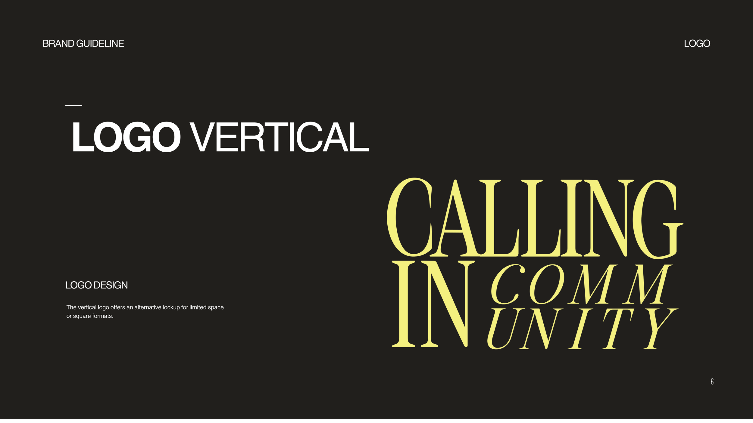
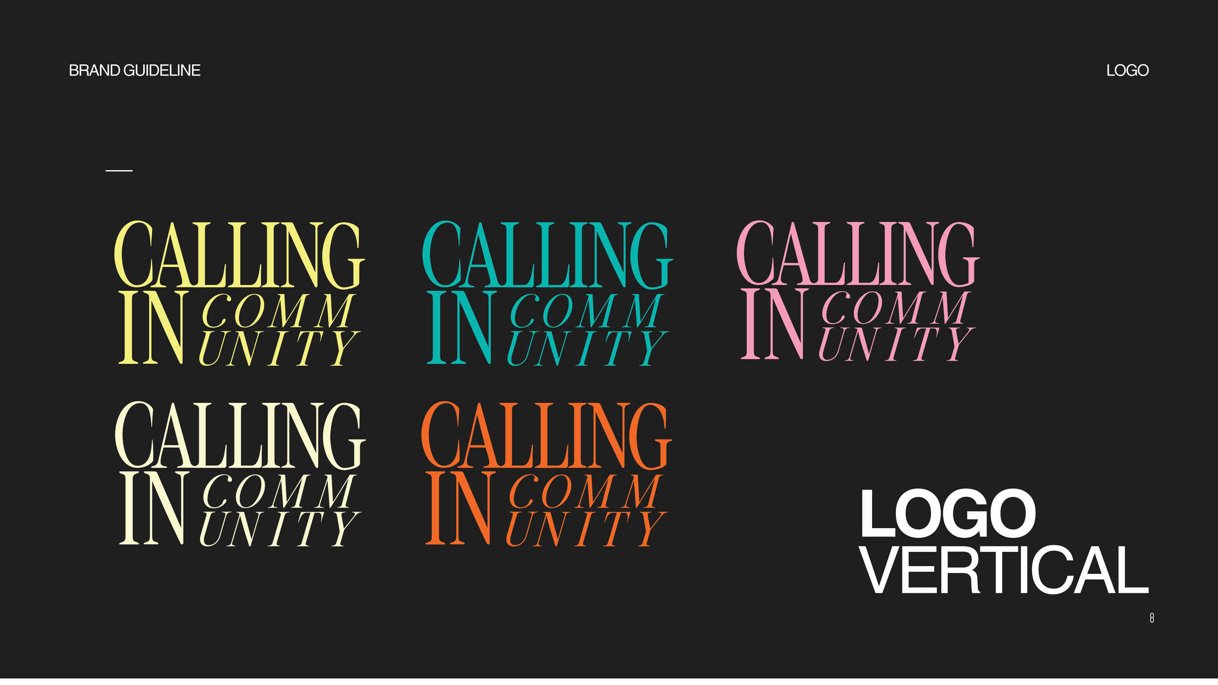
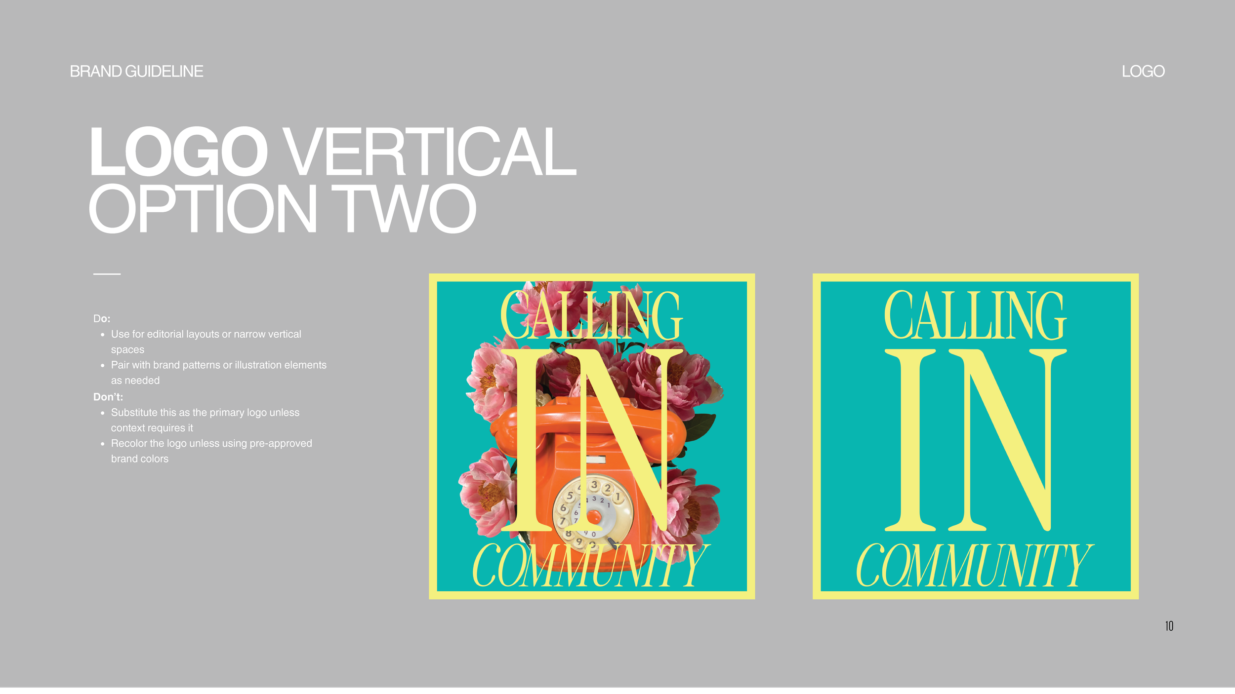
Developed multi-format logos—horizontal, vertical, and secondary lockups—tailored for both digital and print applications.
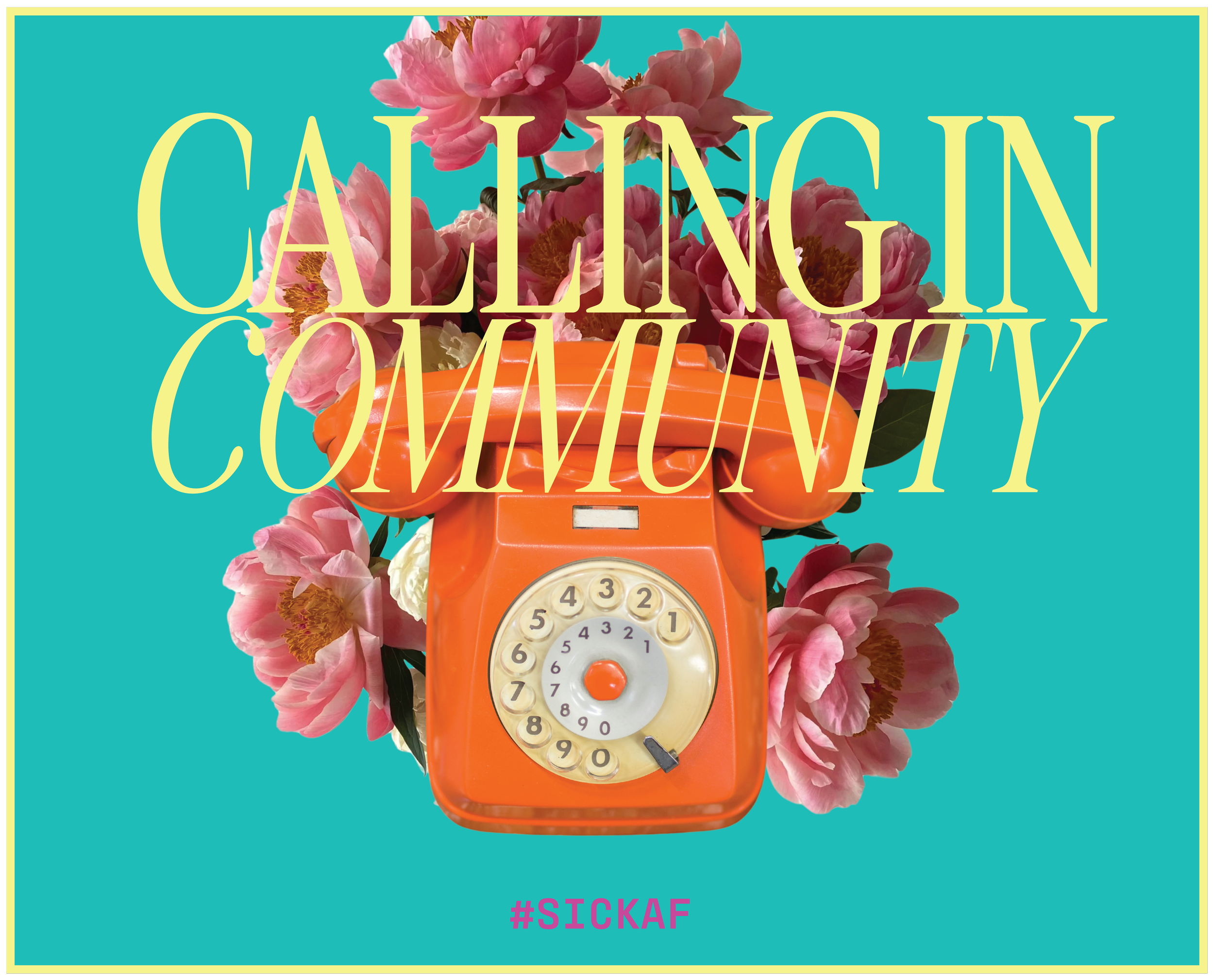
Drew visual inspiration from the whimsical, cinematic aesthetic of Wes Anderson, incorporating his signature use of balanced compositions and nostalgic tones to create a sense of story and charm.
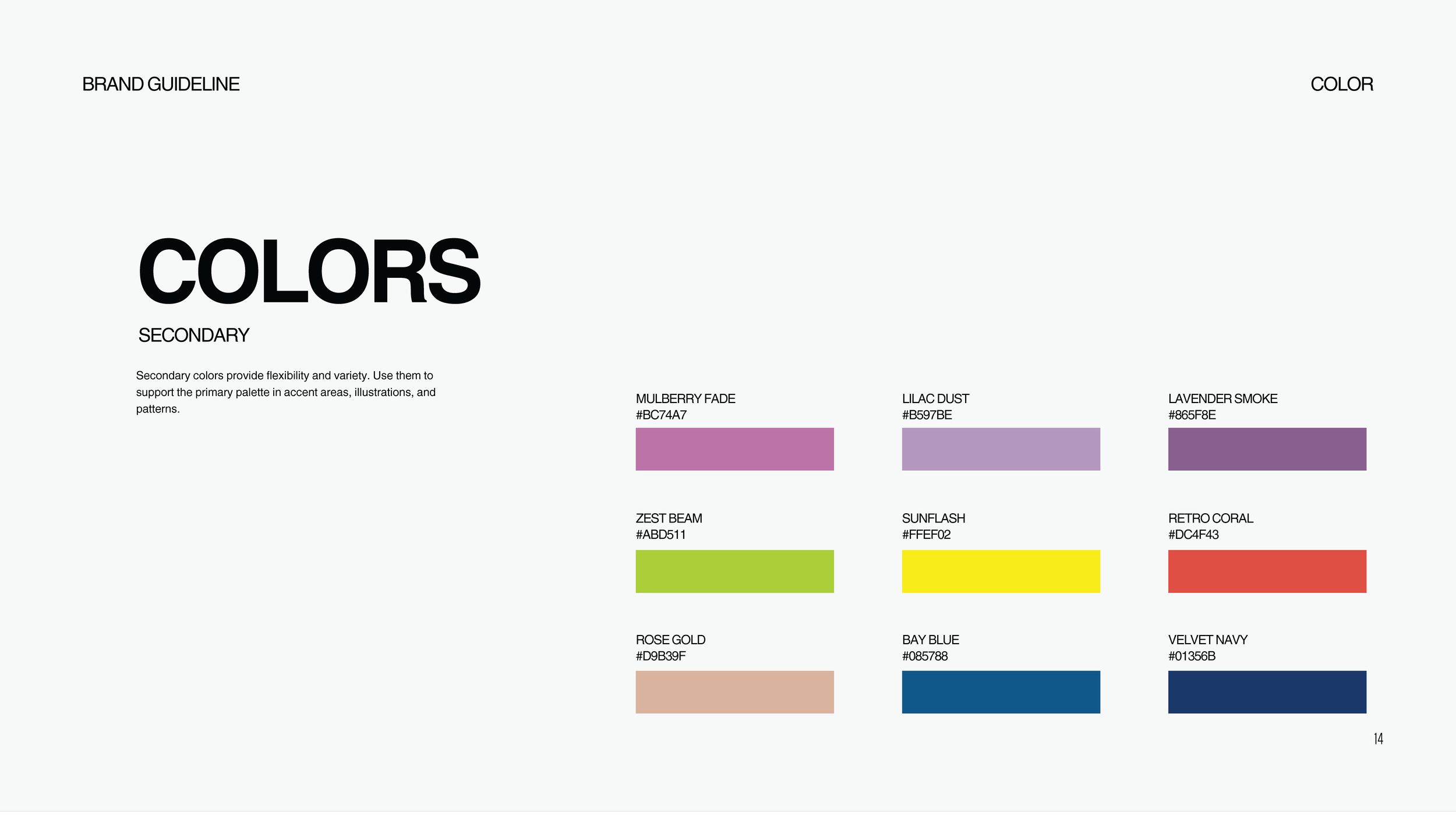
Created a color palette that evokes warmth, softness, and vibrancy while maintaining strong accessibility and versatility. Influences from Wes Anderson’s color sensibility guided the selection of key brand colors, including Tidepool Teal, Sunny Day, Peony Pink, Vanilla Fog, and Tangerine Dial.
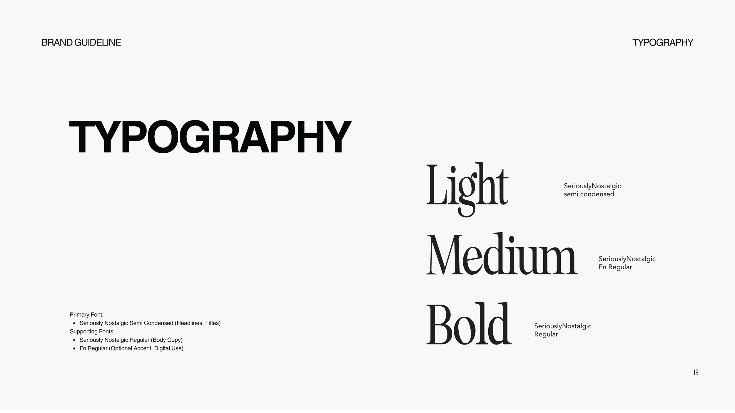
Selected and implemented the Seriously Nostalgic type family to establish a distinctive, approachable tone across headings, subheadings, and body text.
Brand Development & Visual Identity
-
Produced a comprehensive visual brand guide that outlines:
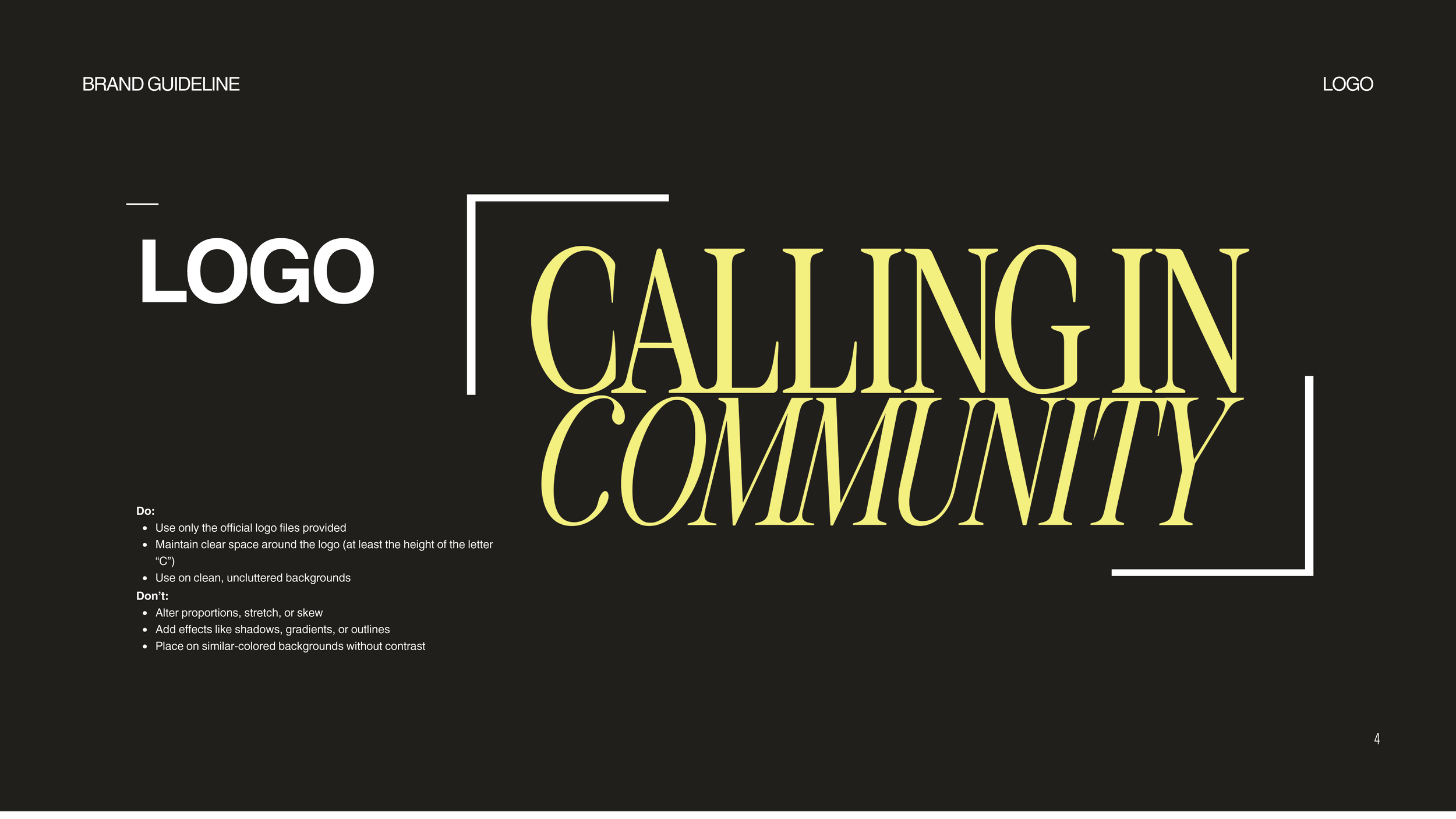
Logo usage rules (do’s and don’ts)
Typography hierarchy
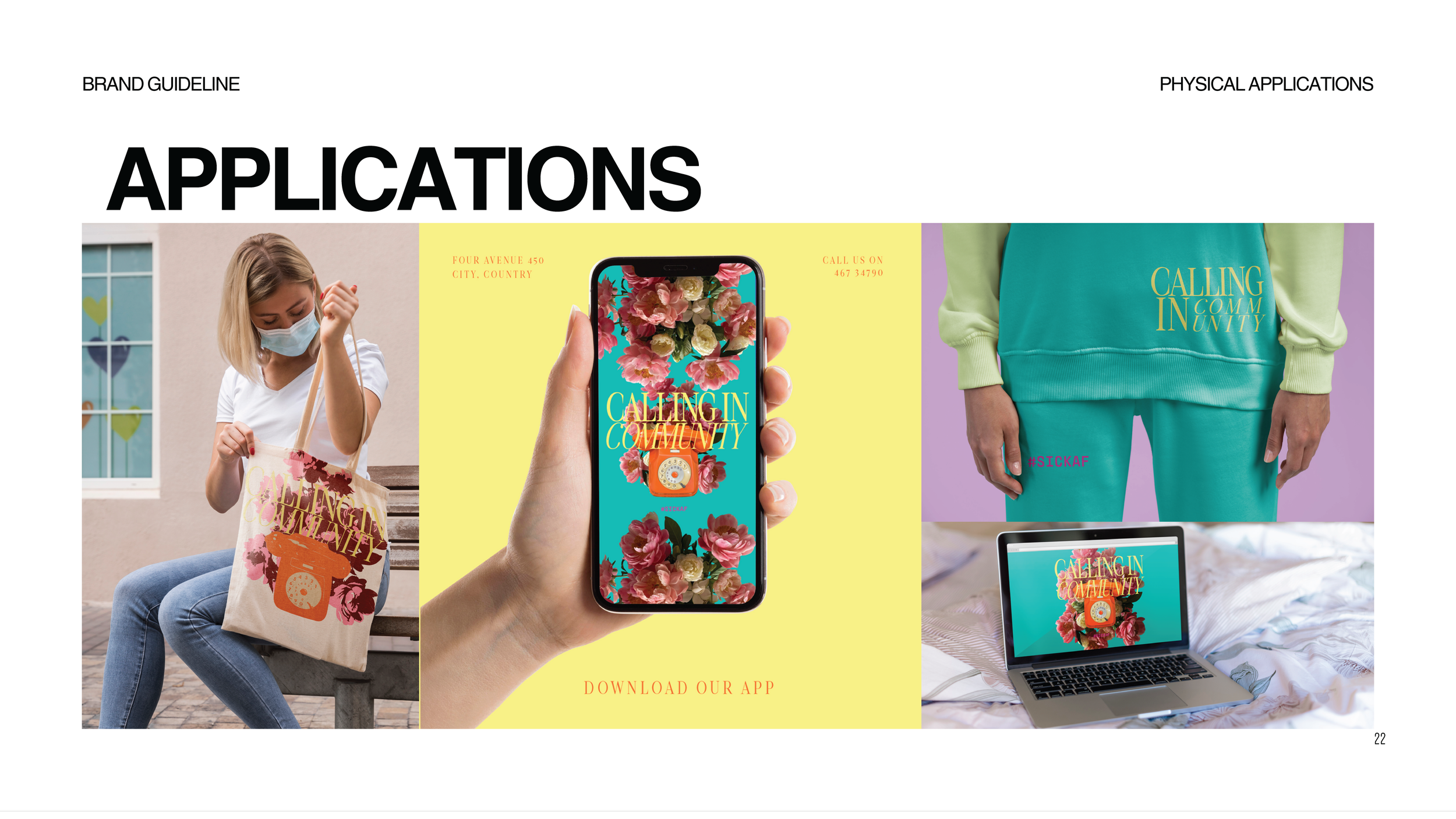
Digital applications
Use of iconography, illustrations, and patterns
Physical collateral and packaging examples
Created a one-pager quick reference for team members and collaborators to maintain brand consistency across platforms
-
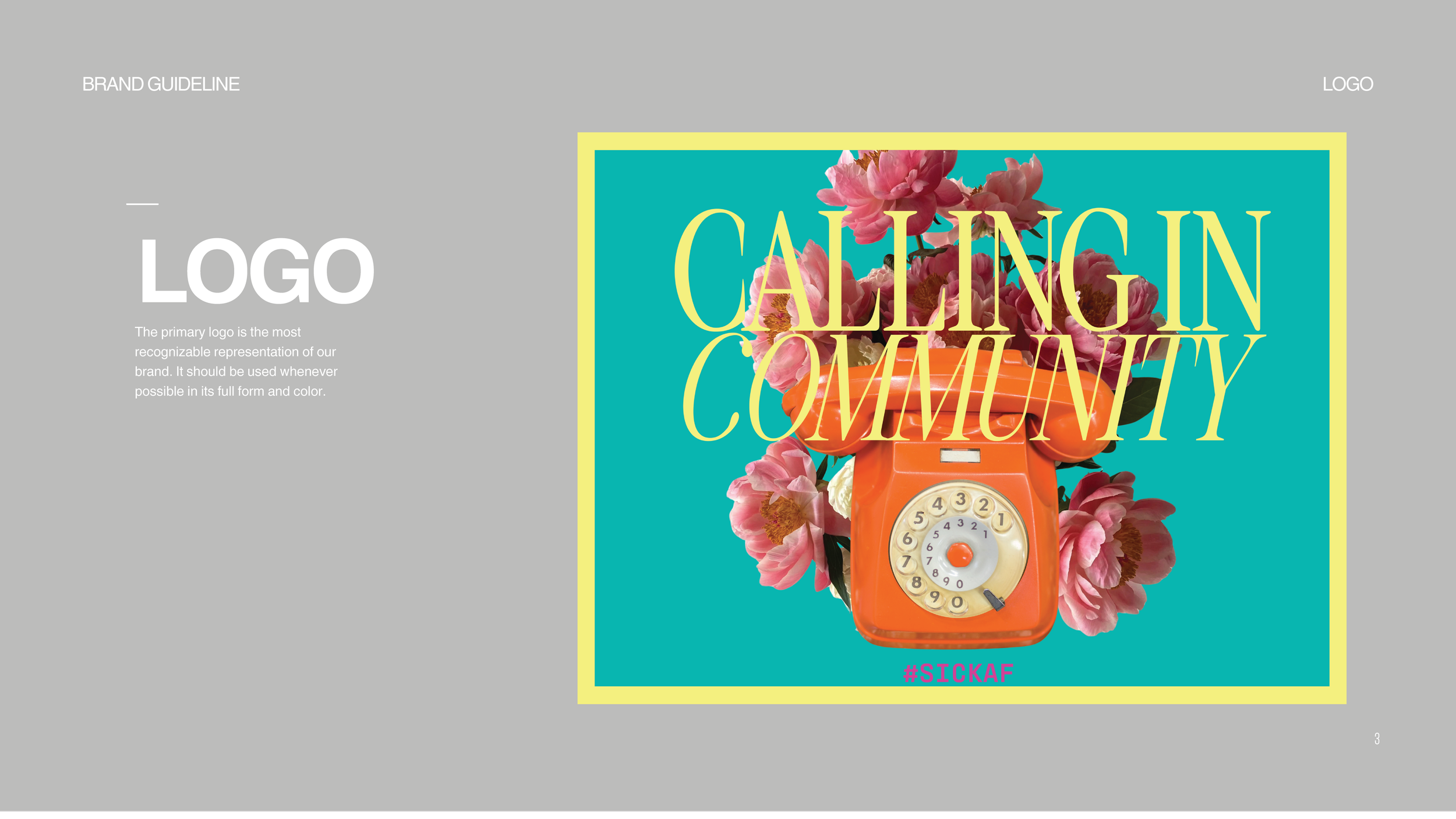
Primary Logo: For wide applications with emphasis on community and warmth.
Vertical Variants: Designed for use in social media, avatars, and print collateral.
Maintained strict clear space, legibility, and contrast rules for scalable, multi-platform integrity.
-
Employed a multi-dimensional palette reflecting:
Calm (Tidepool Teal, Vanilla Fog)
Joy (Peony Pink, Sunny Day)
Energy & Momentum (Tangerine Dial, Harvest Gold)
Each color was selected to visually communicate the brand’s core values: community, support, humor, hope, and authenticity.
-
Seriously Nostalgic: evocative of familiarity and softness
Built hierarchy through use of weight, size, and letter spacing—reinforcing accessibility and ease of reading.
-
Emphasized gentle illustrations and iconography that support emotional safety.
Avoided harsh or corporate design tropes to instead evoke empathy and humanity.